May – August 2022
I created the logo for the DEBS (Department of Employment and Benefit Services) CARMA (Case Accuracy Review Monitoring Application) application with my team member. It’s an internal case reviewing application. This is an outline of the process.
DEBS staff would be using the CARMA app to monitor, check for accuracy, and update any case information. Preliminary work on the design system of the app as done in parallel with the logo design. This design system was reflected in the color choices I made for the logo.
We had a few requirements to meet as we were designing:

(-) Choose a readable font that reflects the app's purpose
(-) Create a visual representation that tires into what the app does
(-) Choose harmonious colors that reflect the colors used in the app
(-) Establish a friendly and inviting image that reflects the user and their role in the app
(-) Be able to render the logo in multiple formats for different uses, including a scalable vector that can be used at any size
We met with the DEBS staff to discuss the goals of the app. After we met with them, we needed to figure out how we wanted to reflect those goals, so we researched logos, colors, and typography. Then, I organized our findings into mood boards.

A mood board is a collection of related objects like text, colors, and images that share a theme you want to explore. The CARMA mood boards consisted of color combinations, color connotations, thematic concepts, typography, and other logos.
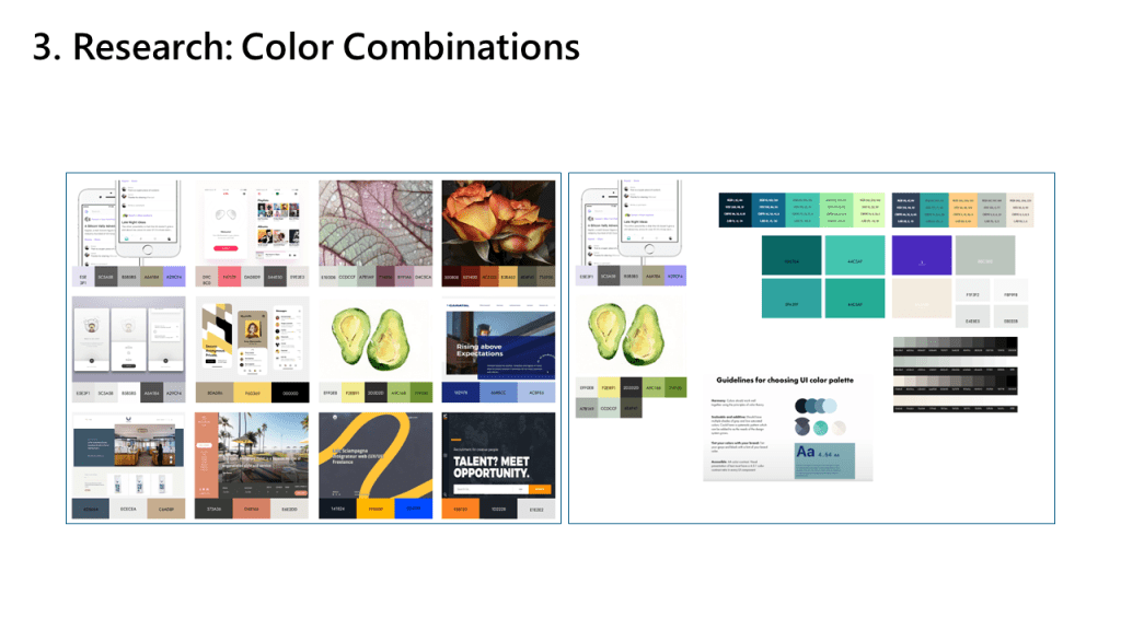
My goal was to bring more engagement and excitement to a task that could be repetitive. Some factors I kept in mind while looking for color palettes were vibrant and harmonious color combinations.

Another factor I considered was the appropriateness of the different colors. The colors needed to look good together, but also work well together on the application.
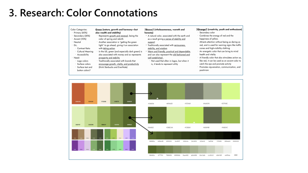
I researched the meaning of colors and some definitions I found were that green represents growth, brown is associated with stability, and orange combines the energy of red and happiness of yellow.

Additionally, I looked into how the temperature of colors impacts our visual perception. Warm colors or colors with warm undertones evoke a sense of comfort and urgency, and promotes activity. On the other hand, cool colors or colors with warm undertones makes  space feel more open and evokes a sense of calm.
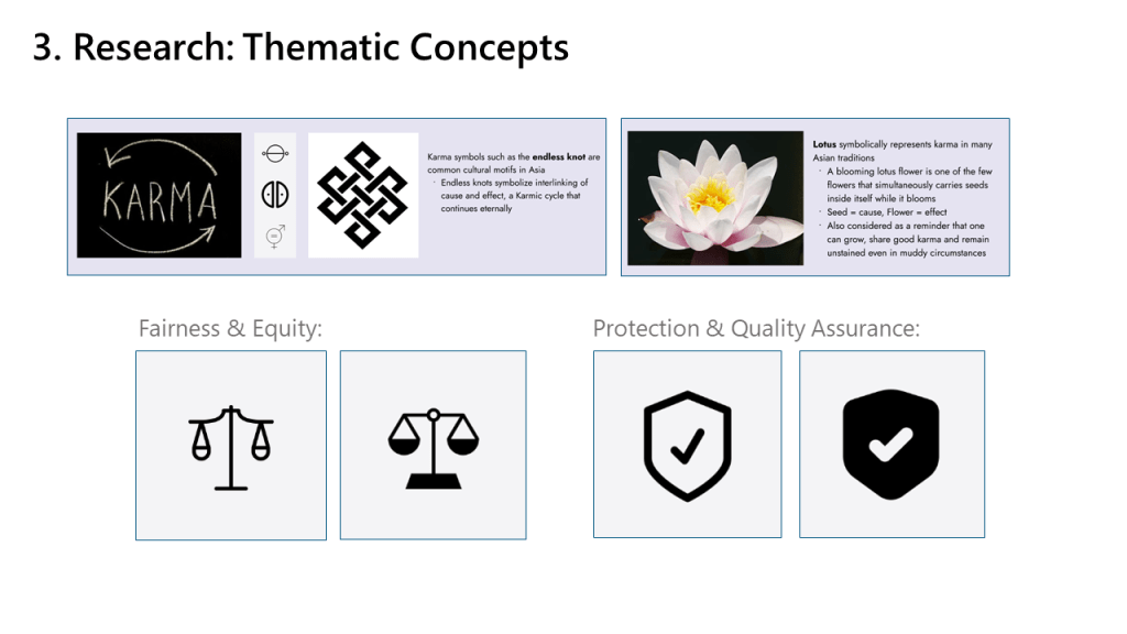
We brainstormed themes based on the application and what it does.

Karma: The first theme that came to mind because of its cyclical connotations. The CARMA app's review process is a cycle.

Lotus: Another way karma is represented.

Fairness & Equity: A concept that's key to the app's checks and balances system.

Protection & Quality Assurance: DEBS staff wanted to explore this theme.
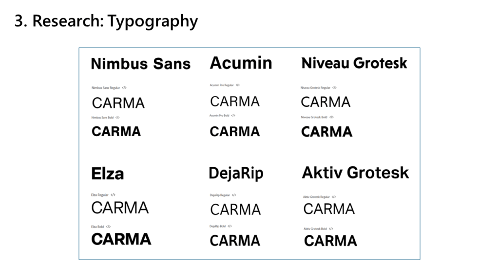
I decided to go with a sans-serif font. They convey modernity and simplicity, and are readable even on low-resolution displays.
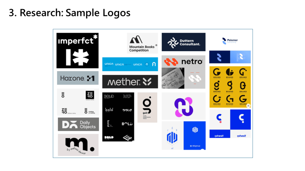
I looked at wordmarks and logos that incorporated text.
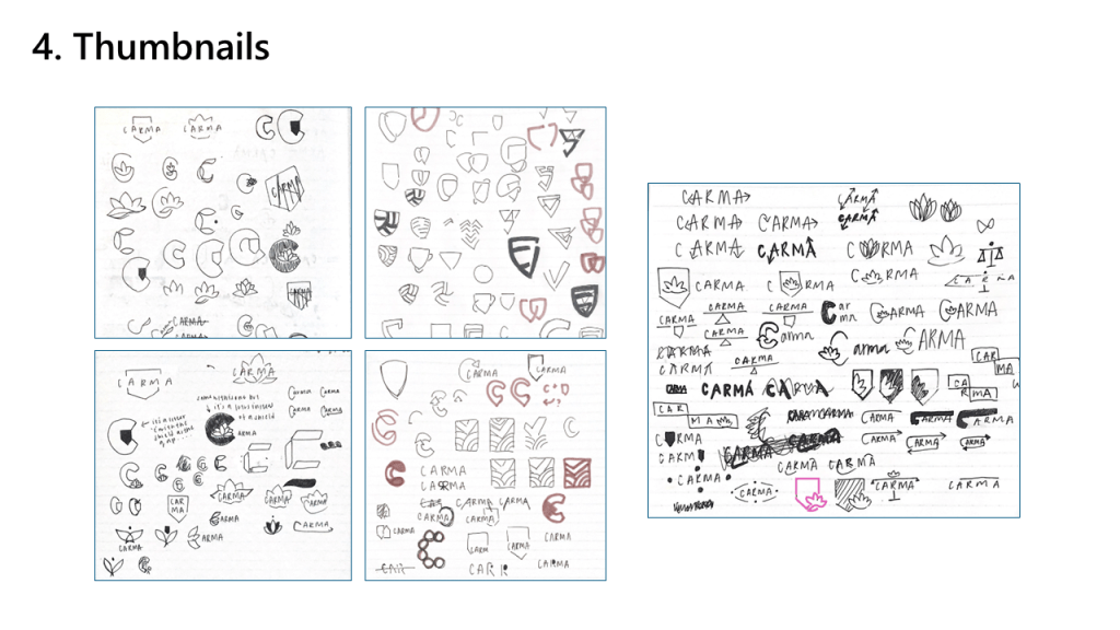
Now that I had my inspiration, I began the thumbnailing process. Thumbnails are quick, rapid drawings that convey an idea, rather than a detailed concept.

I went through multiple rounds of thumbnailing in my notebook to develop initial ideas.
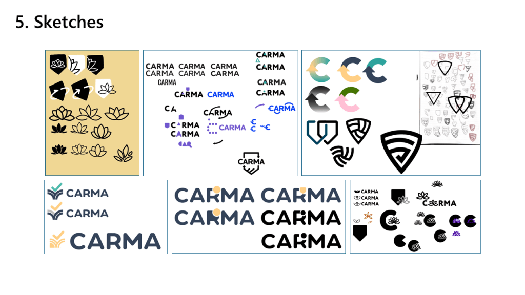
Once I finished thumbnailing, I imported my thumbnails into Illustrator and fleshed them out as vector sketches. During this stage of the process, I would also solicit feedback from other staff and iterate my ideas.
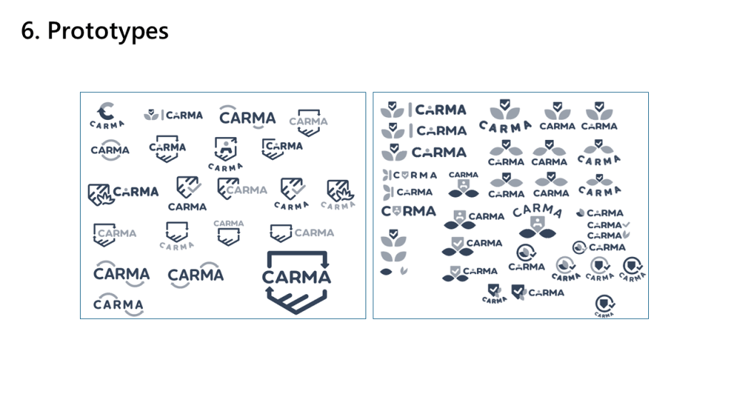
After sketching and coming up with new logo concepts, I narrowed down and refined what I had in preparation to present to the DEBS staff.
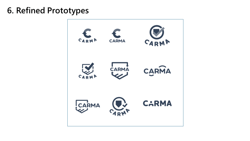
These were the nine refined concepts that we presented in the first round.
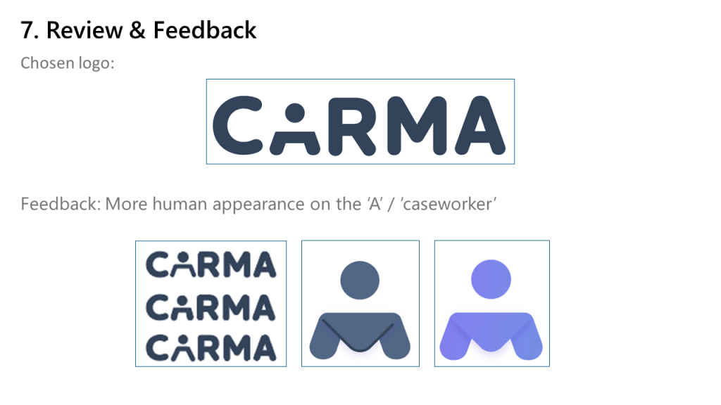
DEBS staff chose this logo as the direction they wanted to go in. What appealed to them was the human element represented in the 'A' of the logo.

They gave us feedback and requested a more human appearance of the 'A' and we went through multiple tests to find the final version.
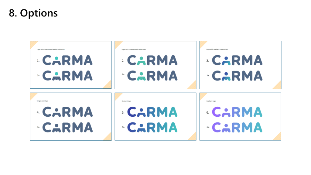
We finalized the logo and presented these six options to the DEBS staff.

By this point, we also finalized the color palette and design system. The colors that were chosen were a yellow and blue palette with teal accents. The palette was warm and it was easy to distinguish different functions in the app.

All of the colors for the logo were taken from the color palette. I wanted to extend the palette and bring in another color and that resulted in option #6. The gradient for #3 and #5 are the teal and dark blue.
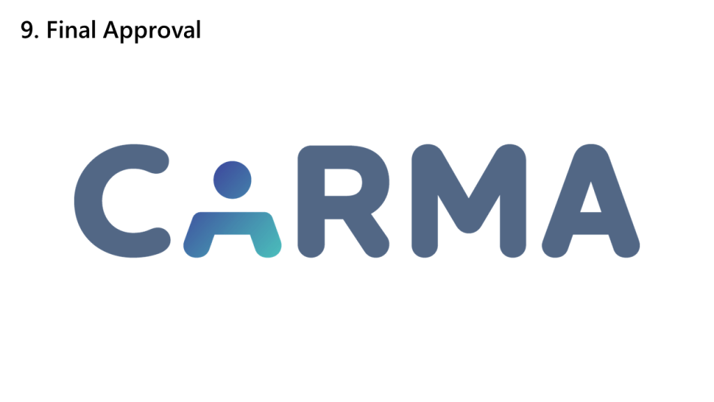
This is the final CARMA logo!

I worked on the logo from the end of May to the end of August and it's been an amazing learning experience.
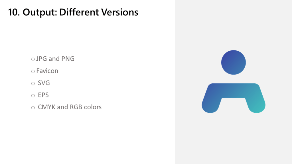
Once the logo was created and finalized, I created all the different versions of the logo that DEBS staff might need.

Some versions to note is the favicon, which is a website's icon, and an EPS file, which is used for printing.
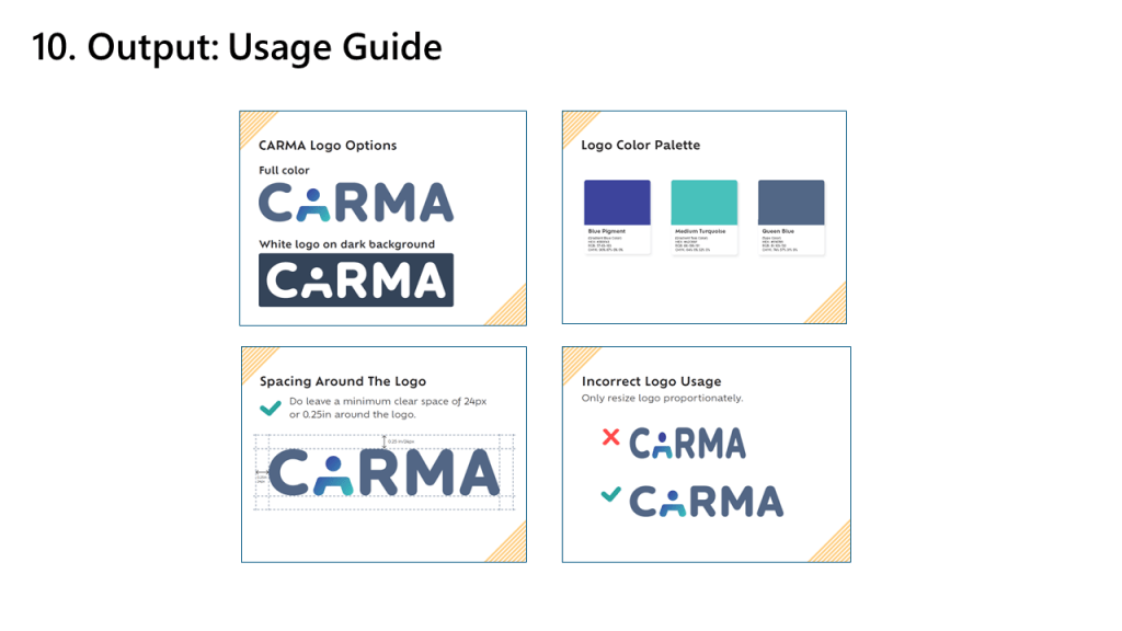
View the usage guide here.

I also helped in the creation of the usage guide. As its name suggests, the usage guide provides an outline of the logo and how to use it.

It includes:
(-) Different forms of the logo
(-) Logo and app color palette
(-) Spacing guidelines
(-) Correct and incorrect usage of the logo
(-) Which version of the logo to use and when to use it
